When I went to bed on Monday night after class, I spent a very long time scrolling through Spurious Correlations, often laughing at the ridiculous connections between data. In a time where infographics can be the difference between a dead or highly popular post, it is important to understand what is being presented to us and how.
I could not help myself but to look a little further and find examples of terrible data for us to enjoy.
Business Insider was kind enough to compile The 27 Worst Charts Of All Time for me to share with you. Here are some good ones:
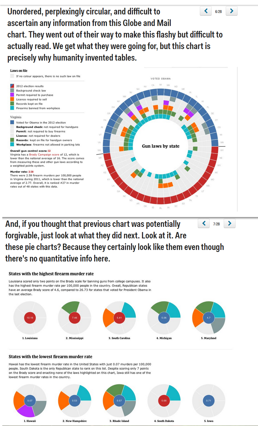
What a useless chart…
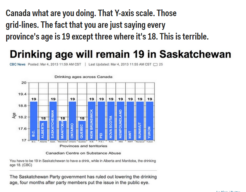
And this one is just ridiculous

And if you have a lot of time in your hands between final papers and life, take a look at this website. You could spend hours in it taking a look at bad attempts of data visualization.

Leave a comment