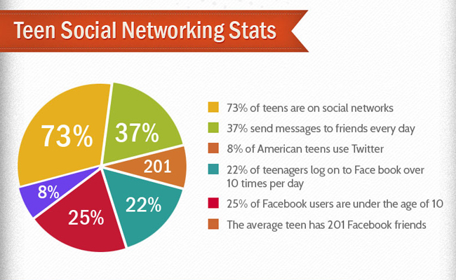
I was looking for a useful chart that could summarize social media usage amongst teens and I came across this chart. What a great example of useful data presented in the worst possible way. Pie charts should be used when you are trying to compare parts of a whole, not random data that will look pretty in a circle.
 Have a good summer, everyone! And do not forget to share any good examples and offenses to communication.

Leave a comment