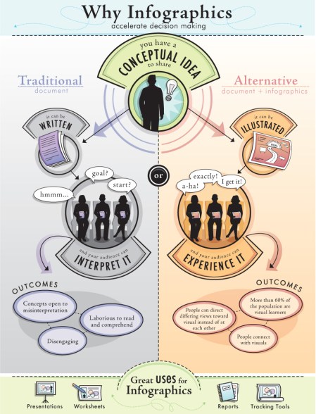
You have around five seconds to capture my attention as a reader. That’s about as long as a virtual hug.
While it’s critical to use every tool to get your point across, including infographics and data, it’s most important to be accurate.
Kimberly Turner, on PROBLOGGER, offers helpful guidelines for building your own infographics, including tips for doing your research and citing your sources.
I’m also enamored with the British website Information is Beautiful, recently introduced to me by my friend and colleague, Cora Crary. This resource is full of inspiring visuals and new ideas for telling your story through data.
As people who work in the industry, it’s sometimes easy to recognize bad facts or bias; but that’s not always the case for the community contributor. I appreciate the encouragement offered by Josh Catone on Masable in “Why New Media Literacy Is Vital for Quality Journalism.”
Josh wonders, “What happens if media literacy training doesn’t keep up with the acceleration of the information stream? What happens as the line between trained and citizen journalism continues to blur? What happens if our kids can’t pick out fact from fiction?”
That day — the digital future — has already arrived. As a consumer, I see the line between content and ads blurring all the time. As a professional, I know I need to slow down, check facts, and train others to take more care.
Questions: 1) How do the proliferation of infographics change the fact checking landscape? 2)How have the tools for fact checking changed in the past decade? 3) Has it gotten easier or more difficult?

Leave a comment